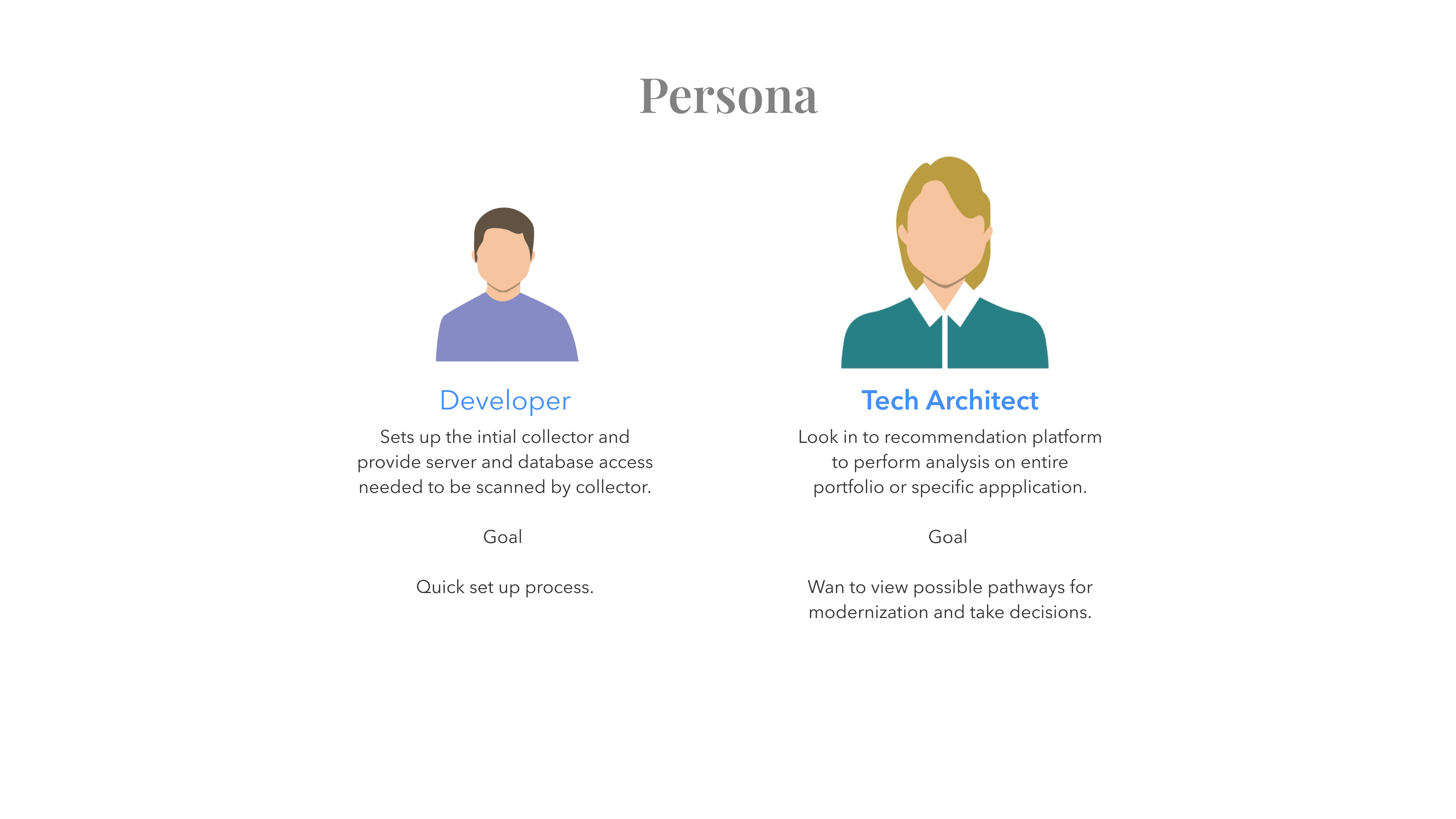
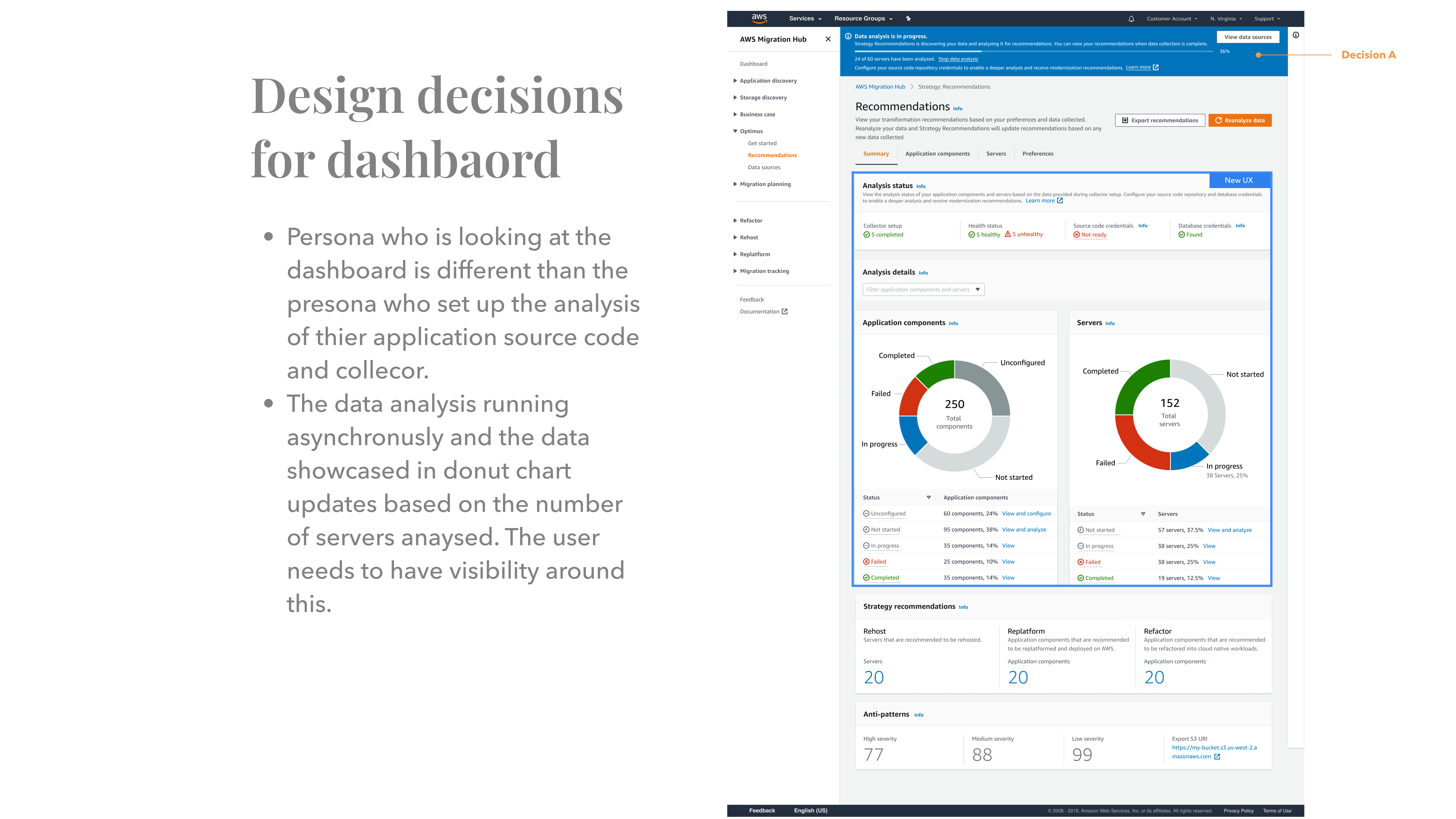
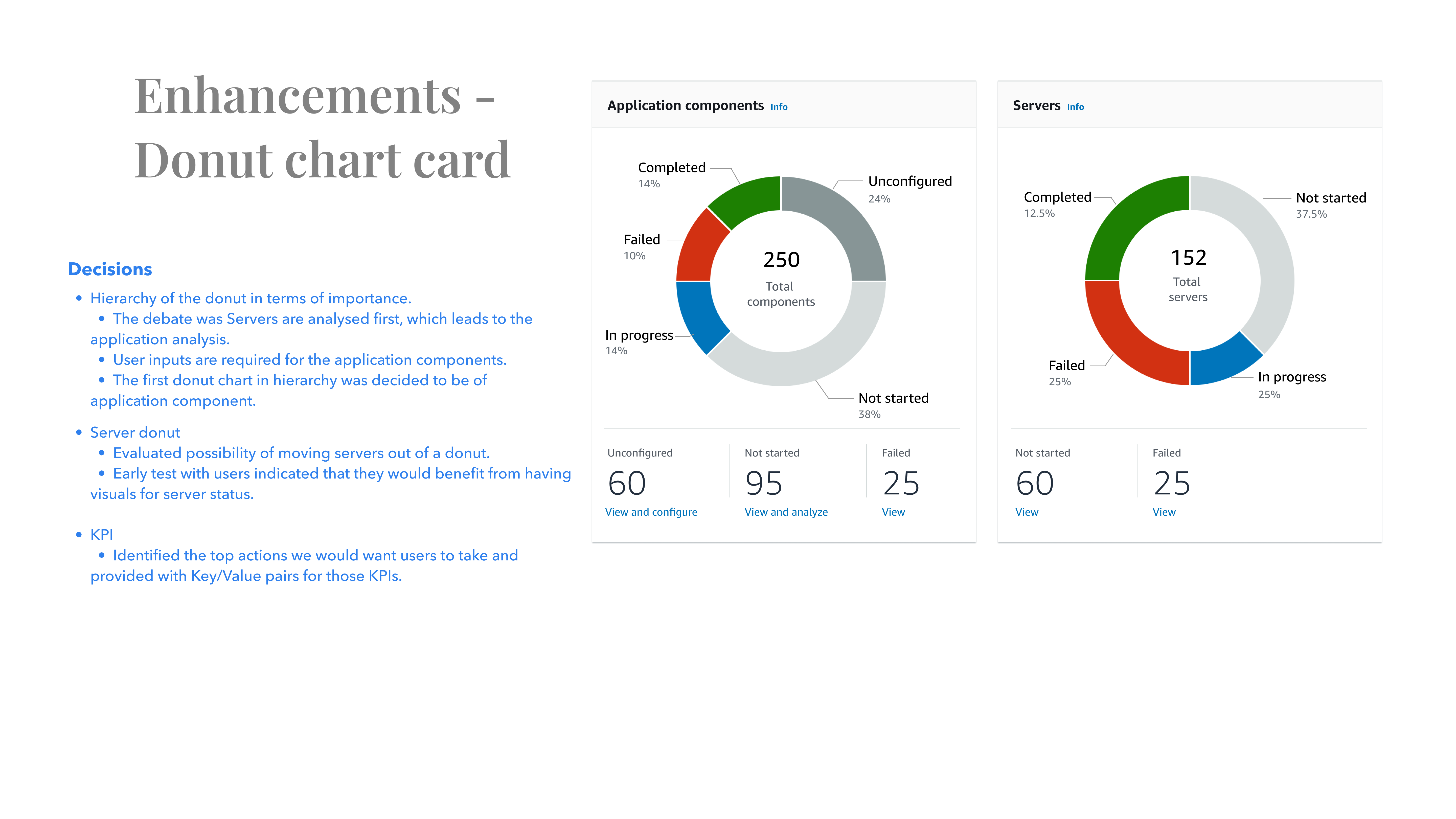
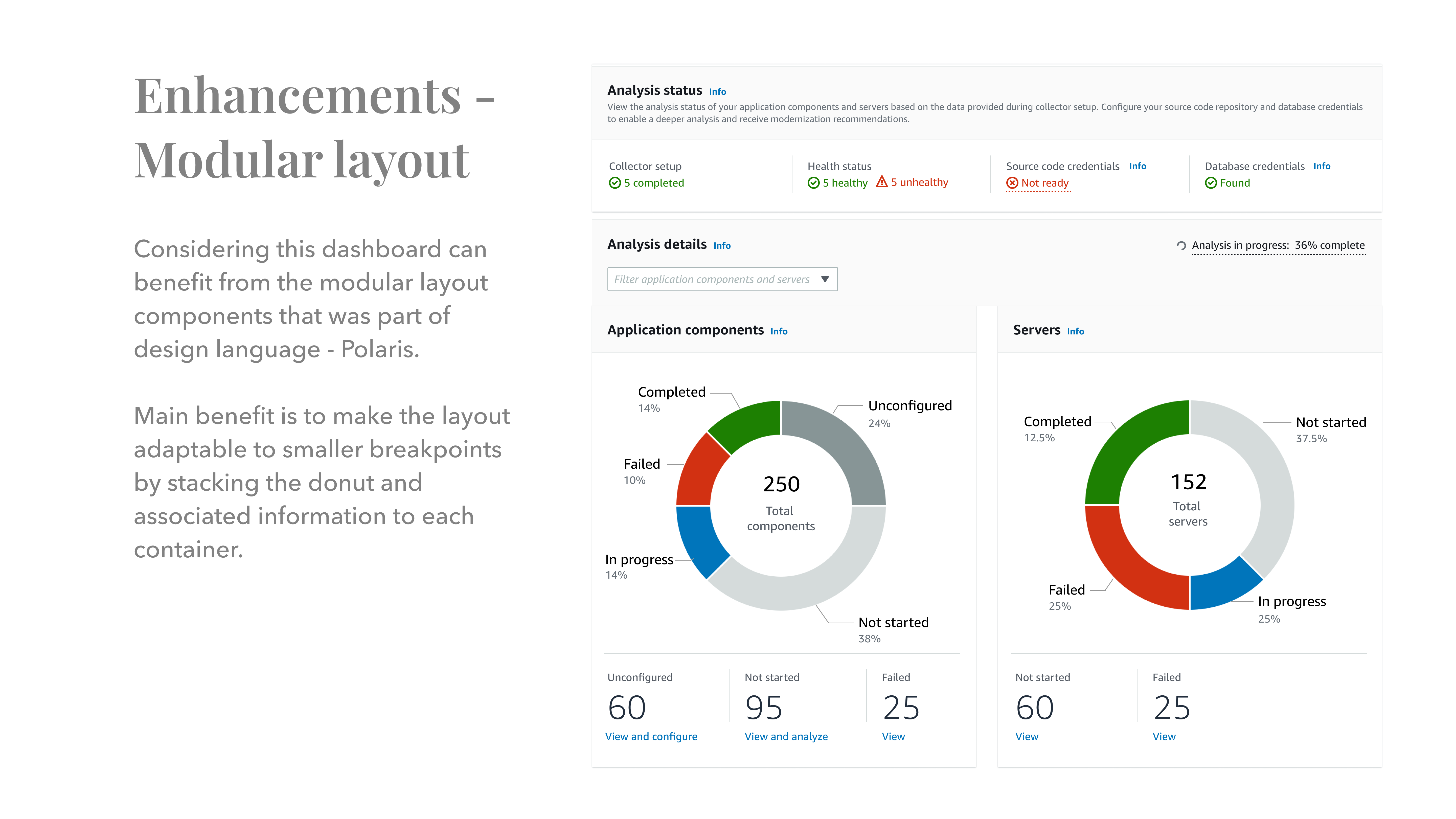
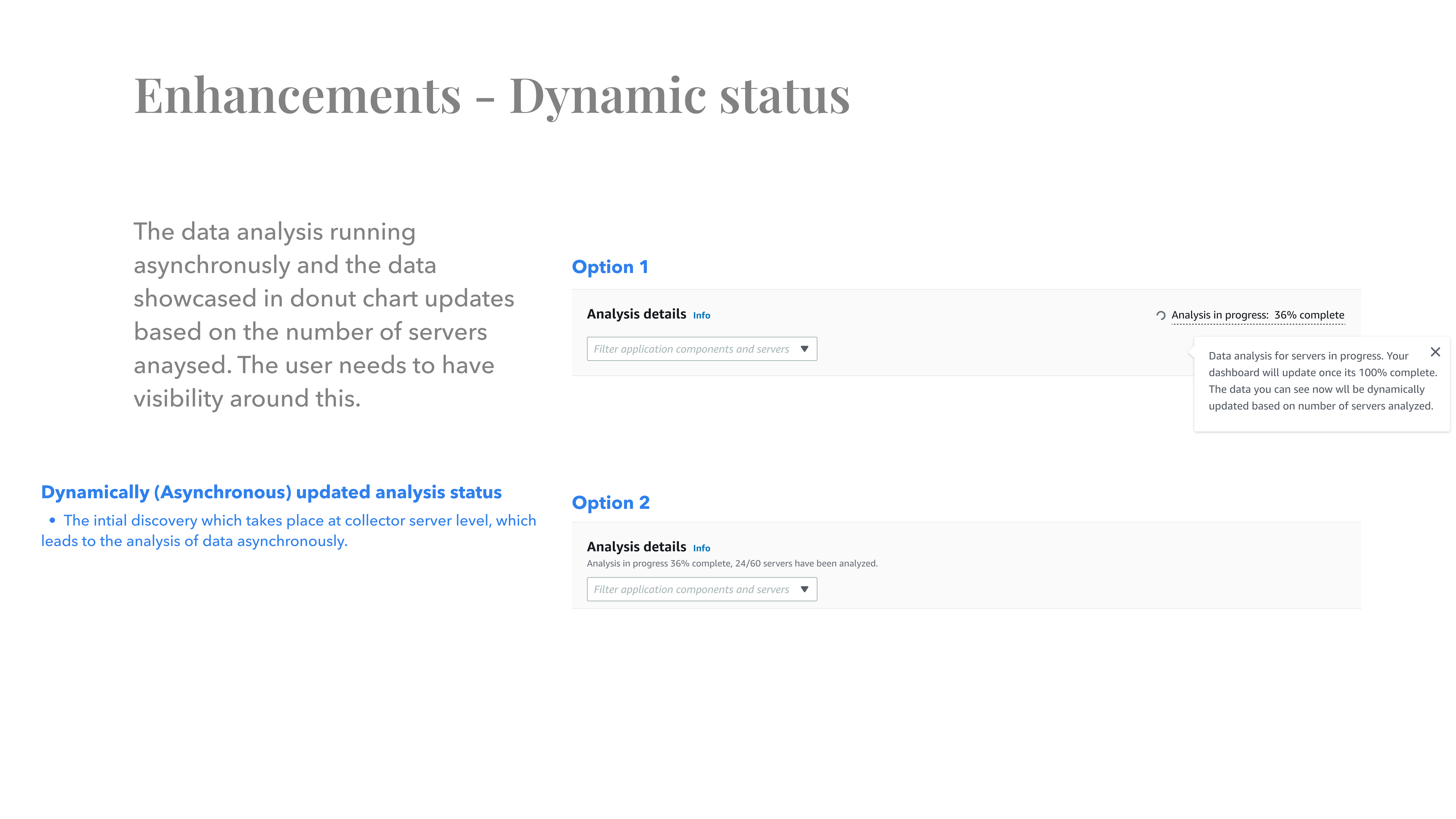
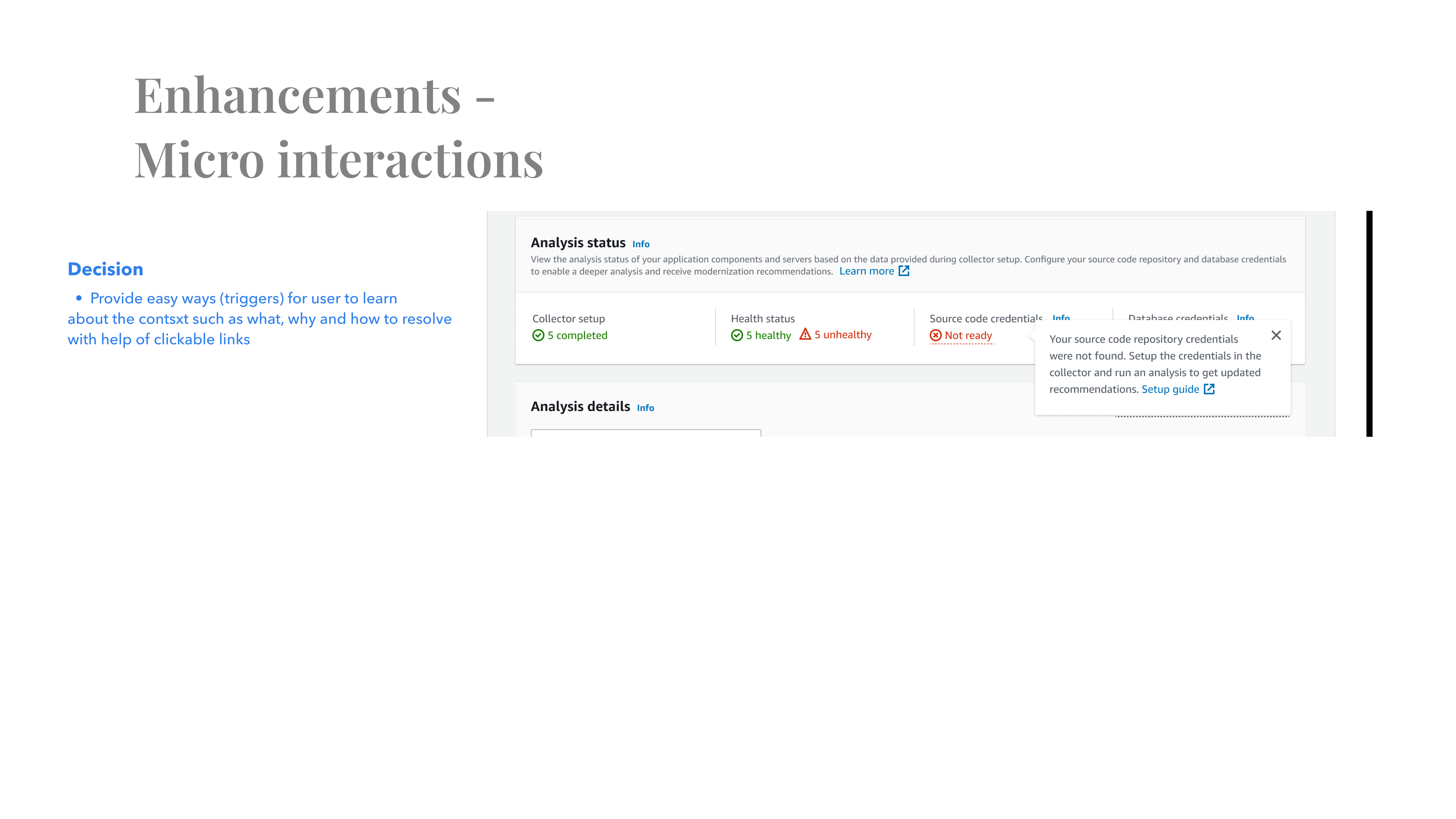
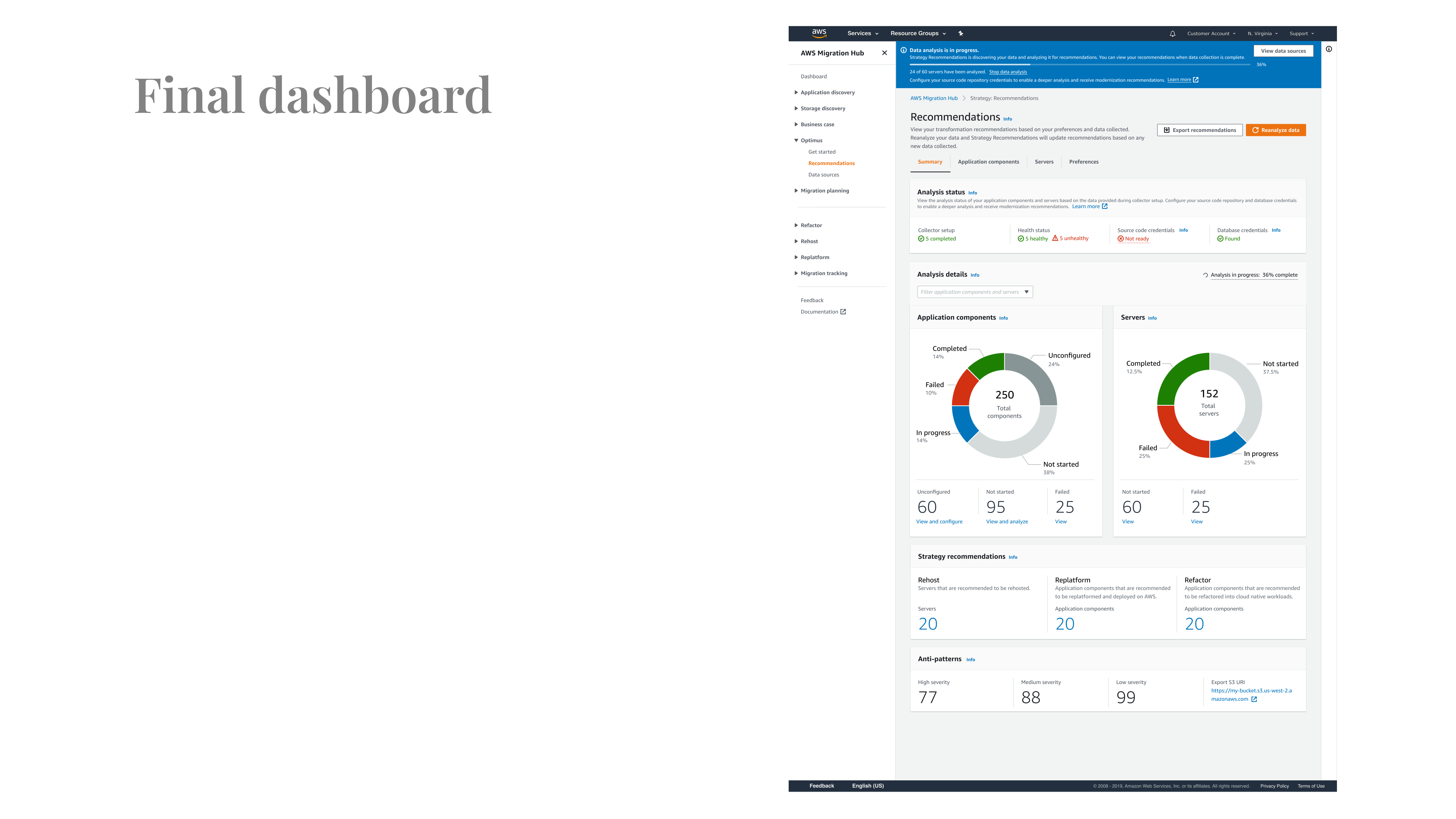
The old dashboard had very low adoption. The data suggested users were not able to understand the flow. The dashboard KPIs did not make much sense to the users. Our research also suggested that the persona who set up the servers were Developers but the end user of this dashboard were Tech Architect. The older dashboard clearly missed the opportunity to show the details of the application components, server and their statuses at a high level, which left the users clueless about how to setup and configure the engine to drive strategic recommendations for their workloads. We wanted to solve the usability challenges, such as a simple and easy way to understand data in the form of intuitive charts, contextual actions. And most importantly we wanted to solve the problem of surfacing the information on main dashboard level and provide users an overview of the system. Provide them ways to drill down to the non performing application components and give them clear actions to improve the recommendation score.
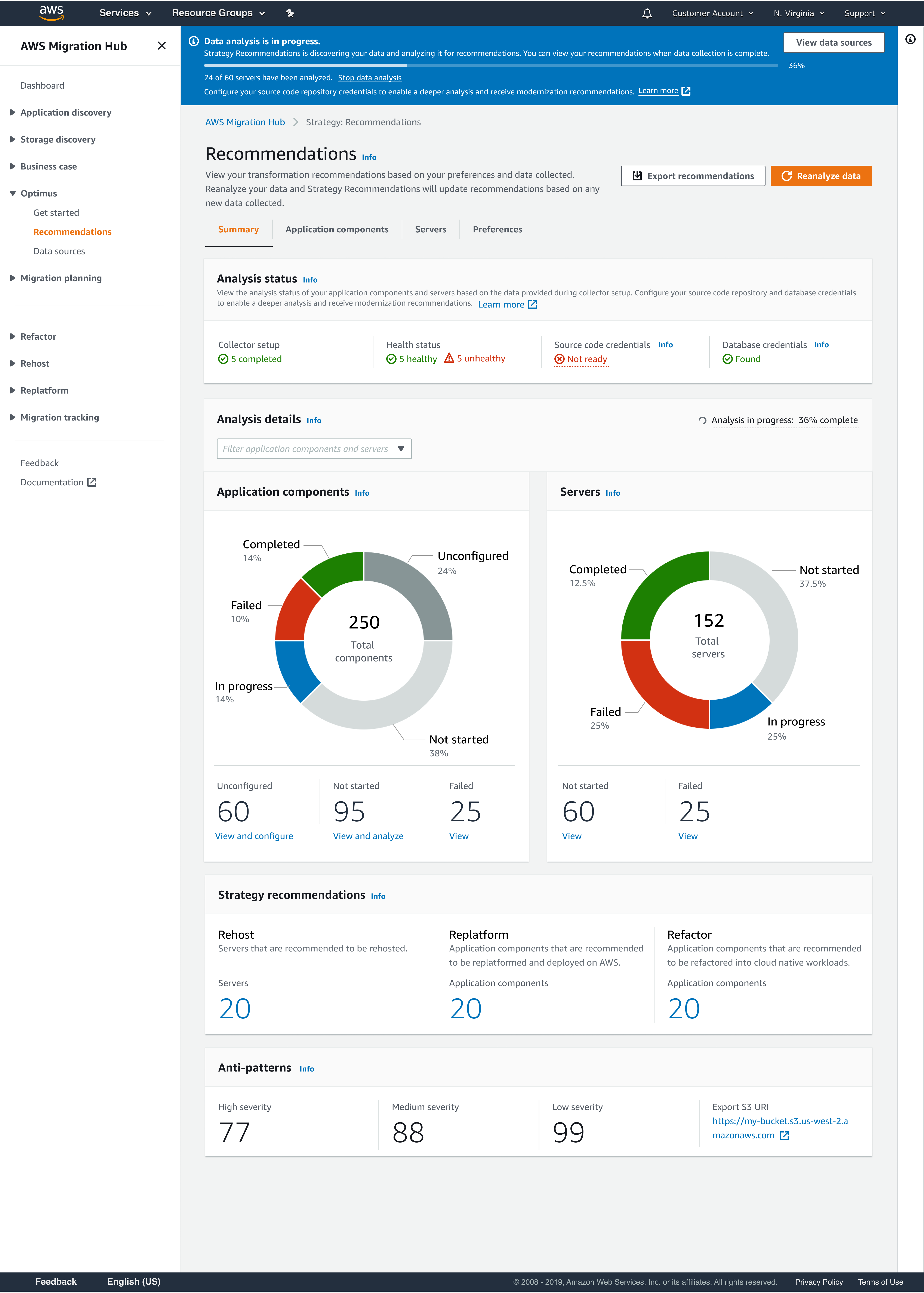

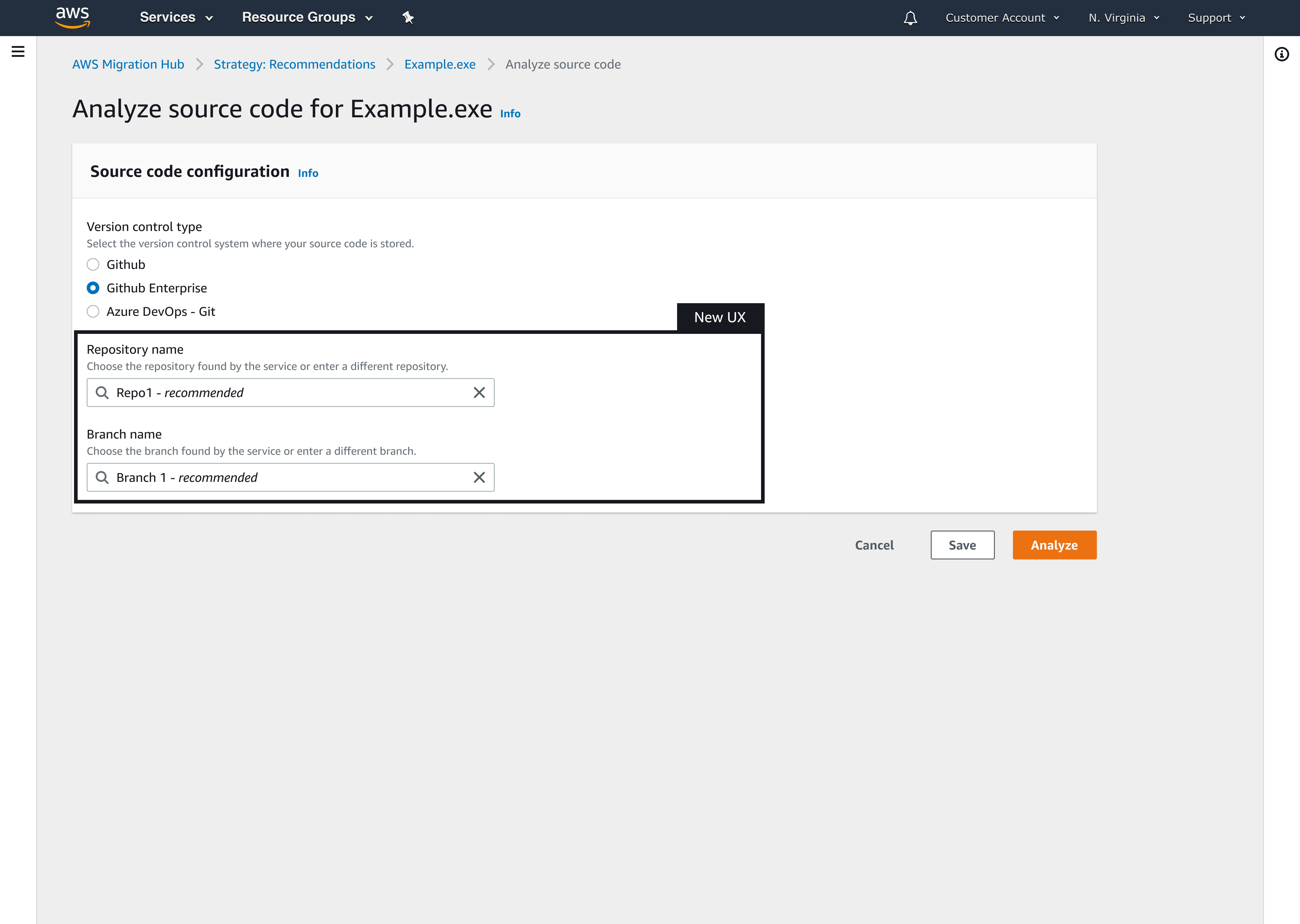
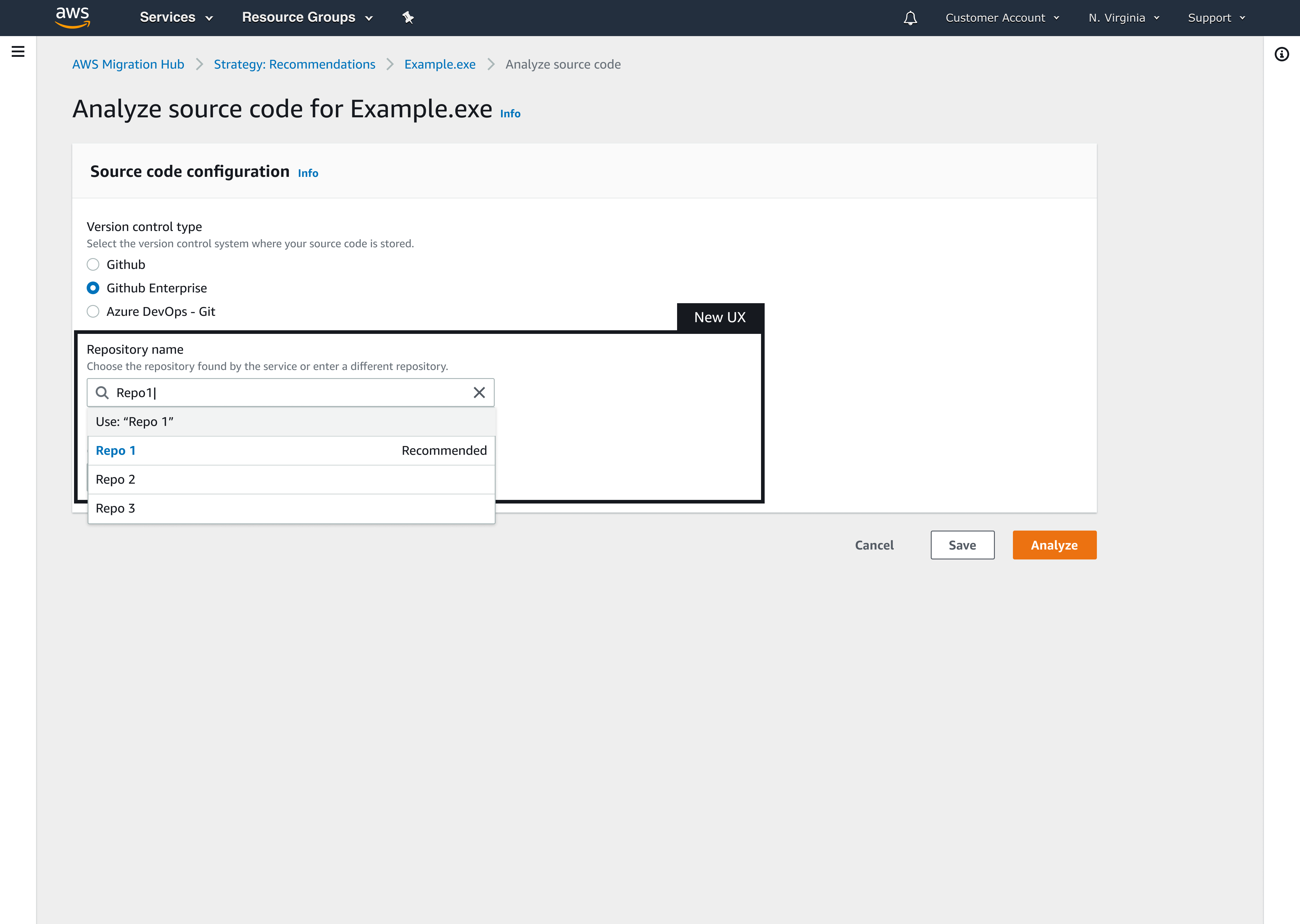
The re-designed application component page has instructional info that sets up context for user, such as they need to configure few things in order to achieve the optimal outcome.
New Key/value pairs were added which helps user drill down to the foundational parameters.
Provided interactions for users to discover the unknowns. For example. provided patterns for user uncover what each status means and how to take actions to help them move faster.
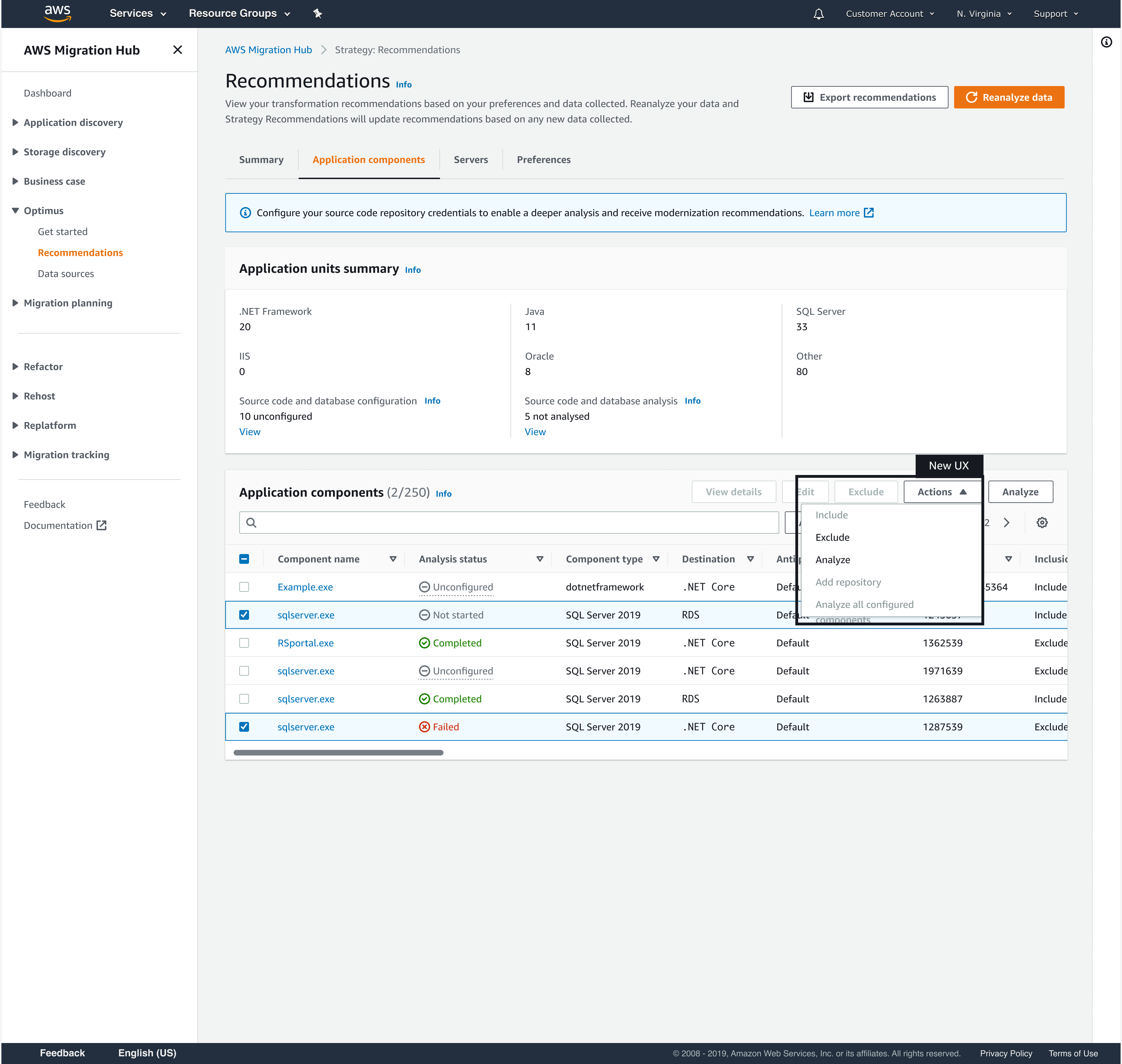
Bulk Action
Provision for bulk actions to help users take actions with ease and get faster results.